
New feature
Fleet cost overview dashboard
- Stage
- Live
- Product
- Monta Hub
- Posted
What's new and how it works
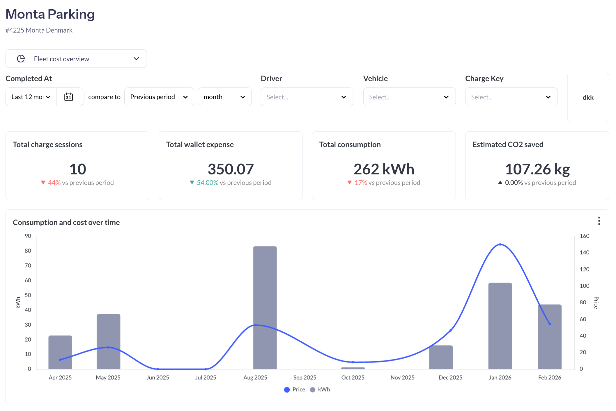
Fleet managers can now access a dedicated cost overview dashboard that brings together all charging activity paid through the company wallet into one clear view.
The dashboard gives you full control over how you slice and explore your data:
- Filter by time period (day, week, month, quarter, or custom range) and compare against previous periods to spot changes over time
- View metrics across your entire fleet or filter down to specific drivers, vehicles, or charge keys
- Track key numbers at a glance: total charge sessions, money spent, kWh consumed, and estimated CO2 saved
- Follow trends through a historical graph showing cost and consumption side by side
- Dig into aggregated breakdowns grouped by driver, vehicle, or charge key
- Export everything to CSV or PDF for reporting and reconciliation
Why it matters
Until now, getting a clear picture of what your fleet actually spends on charging, and where that spend is going, required piecing together data from multiple places. This dashboard gives fleet managers a single place to understand their total charging costs, see how spend is distributed across drivers and vehicles, and track how it evolves month over month. That makes it easier to identify outliers, plan budgets, and report on fleet charging activity with confidence.
Coming next
We're working on adding a breakdown by cost type, so you'll be able to see exactly how much is going toward home reimbursement, depot or workplace charging, public charging, and roaming, separately.
Where and for who
The dashboard is available on all teams as part of the team dashboards